

This project taught me how important it is to weigh short-term clarity against long-term usability. While we couldn’t redesign the underlying architecture within this scope, making the friction visible helped users set more accurate expectations, and helped the business see where key experience gaps were leading to early churn.
That clarity solidified a follow-up initiative to address the deeper issue. It also reinforced for me that systems-aware design often means navigating compromise, while still creating assets and alignment that enable the next step forward.

Lessons Learned
-
The redesign did not reduce churn in the short term, largely due surfacing a misalignment between onboarding flows and certain user goals, rooted in legacy platform constraints outside our immediate scope. Making this friction visible helped reduce misfit later in the journey, allowed us to measure abandonment by customer segment, and informed a follow-up architectural initiative.
-
The project seeded a later architectural initiative to address the deeper system issue.
-
Onboarding inputs were structured in collaboration with the data team to support market segmentation analysis for executive dashboards and product decision making.
-
Visual documentation enabled faster iteration, smoother QA, and a reusable documentation style later applied to other projects.
-
Member support used the annotated UI maps and walkthroughs for internal training and change management.
-
Content and support teams worked more closely with UX on lifecycle messaging, and incorporating learning content provided as value in the product experience, improving consistency across touchpoints.


Results


Above you can see what changed when we included more tailored illustrations and the invitation to receive value through content that marketing tailored for the onboarding experience.

Above captures the first version of onboarding released, you’ll notice that the marketing content screens, and branded illustrations are not included in this release.
To enable longevity and efficiency, I updated the wireframe maps with annotated UI’s. In the final documentation the maps were included along with embedded video walkthroughs explaining design rationale and prototype links.
These helped:
-
Speed up onboarding for future team members
-
Articulate interaction design patterns reducing back-and-forth between design and development
-
Document edge cases and design rationale in context
-
Support member support team training and change management

I would walk the team through all the changes they could expect with each release, utilizing the site map. QA and member support both found the site map particularly helpful for testing functionality. We translated the final version of the site map to a member care reference tool to use for training and as an on call guide.
Form & Function Documentation
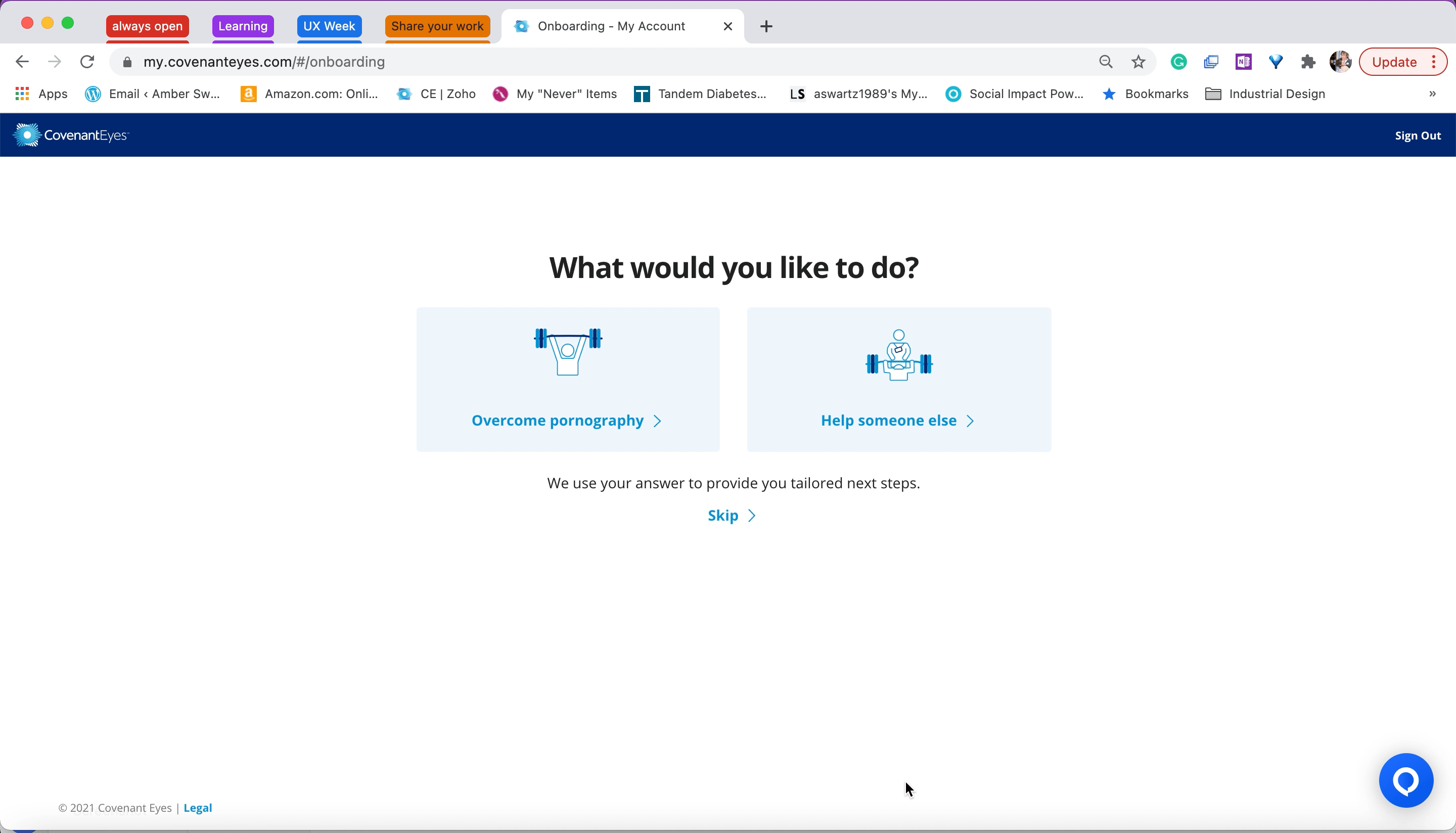
This animated walkthrough shows the first release of the redesigned onboarding flow, where users select their primary goal, either to overcome pornography or to help someone else. This was a foundational step in reframing the experience around user intent rather than system tasks, and it marked the beginning of a more personalized onboarding path.
At this point in the iteration, marketing content and value exchange messaging had not yet been incorporated. These elements were intentionally scoped for a later release to ensure alignment with the content team, ensuring the content we provided was meeting the user's greatest need at this point in their early experience and was not repeated from articles we have shared previously through the marketing funnel. This early version focused on establishing role clarity and gathering meaningful input from users in a way that felt respectful and simple.
I created custom UI screens for each user type and flow, building and incorporating flat illustrations styled after our commercial characters and visual design patterns to make the experience feel familiar to our marketing pages. Some UI components were built from scratch, such as icon-button combinations used on welcome screens.
All screens were designed in Sketch using our design system and component library.

I explored a series of analogy-based concepts to help users reflect on their goals, whether they were trying to stop their own pornography use or support someone else. Given the sensitivity of the topic, I collaborated closely with our marketing team to ensure each concept aligned with brand tone and could be illustrated appropriately.
This work helped us evaluate how narrative, iconography, and user intent could be combined to create a meaningful and respectful entry point into goal-setting without overwhelming the user.
UI Design & Branded Illustrations

Above is a later iteration of the project, and captures what screens would change throughout various parts of the service. Mapping out each iteration gave us a clear way to talk about proposed changes, track ideas we wanted to revisit later, and see how each adjustment would ripple across different service touchpoints.
Some time passed between initial concepts and the onboarding project I led as the dedicated UX Design resource. When there was a call for pitches, I raised the onboarding concept again, this time in a more concrete fidelity, starting with wireframing the screen-by-screen user flow. I translated our chosen concepts into a full-onboarding site map. Each wireframe was mapped sequentially to the live experience, calling out which screens were new and how they would impact connected systems or support workflows.
This allowed:
-
Fast scope and direction alignment with stakeholders
-
Quick documentation update process
-
Smooth handoff to devs and QA
-
Clear planning for scoping multi-release changes
-
Easy to follow documentation for support team members and leadership planning training guides

The above is an annotated wireframe site map I developed to capture each iteration and build on as we moved closer to UI design. This was the first iteration of what would become several releases spanning several months. Showing how the new onboarding steps would connect to the existing setup, highlighting what is new, being updated, or remaining the same allowed the development team and I to pick the project back up quickly when the next iteration came around.
Wireframing & Cross-System Mapping

These early UI concepts helped stakeholders imagine how the experience in the story boards translates to the context of the user’s onboarding experience in our service which enabled us to discuss the best direction to move forward.
We compiled our findings and began prototyping experiences using visual storyboards that brought to life what onboarding could look like if we started from user intent rather than system steps.
Visual storytelling helped the team and our stakeholders:
-
Visualize the impact of possible directions for real-life use cases
-
Think outside the current system and service
-
Explore divergent concepts
-
Make early decisions without getting bogged down in UI
-
Have a clear understanding of the shared direction

This video shows early storyboard concepts used to help stakeholders visualize onboarding in the context of a user’s real life. At the time, storyboarding was not a common design practice in the organization, so using this format created a shared language across teams and helped build alignment around the work.
Each storyboard illustrated scenarios uncovered during discovery, like users abandoning setup due to device handoffs, family dynamics, or confusion over next steps. These moments helped stakeholders understand that onboarding wasn’t a one-time event, but a sequence shaped by external factors. The storyboards laid the foundation for designing experiences that could flex, follow up, and encourage completion over time.
Storyboarding & Concept Exploration
In the initial discovery phase, another designer and I co-led the work. We set out to understand what needs the new onboarding experience should address for users and for our business.
We gathered insights from:
-
NPS survey responses
-
Interviews with front-line support and account setup specialists
-
Existing research and health metrics tracked by our Data Analytics team
These helped frame early concepts and allowed us to identify high-friction areas like unclear value exchange, missing setup steps, and a lack of contextual help.

The notes we compiled from interviews with front line workers revealed several user needs we dove into understanding beeper throughout the discovery.
Discovery & Alignment


Discovery & Alignment
Storyboarding & Concept Exploration
Wireframing & Cross-System Mapping
UI Design & Branded Illustrations
Form & Function Documentation
The project was shaped by tight timelines, system and capacity constraints, and stakeholder hesitation around usability testing. I adapted my approach to focus on concept clarity, stakeholder alignment, iterative improvements over time, and subsequent project proposals to accommodate our ways of working.

Approach
-
Several key setup steps had been removed from the original signup flow years prior, creating a "one-size-fits-all" setup, even though the service served multiple customer segments with very different needs.
-
A legacy shift in market focus had not been reflected in the onboarding flow or service structure, which still served the needs of the previous audience. This created a mismatch between user goals and the default setup path, leading to high support call volume, incomplete account setups, and early churn.
-
There was no mechanism to tailor onboarding based on jobs-to-be-done, making it difficult to deliver early value, assist with service setup and measure retention or usage patterns based on segmentation.
-
Ownership of onboarding was fragmented across teams, limiting alignment and long-term planning.
-
Branded marketing visuals and messaging were absent from the product, creating a disconnect from acquisition to activation.

Challenge

Overview
Purpose
Redesign the account onboarding experience to reduce churn by better supporting different user needs, improve setup completion, and unlock value from early engagement.
Organization
Covenant Eyes (SaaS for digital accountability)
Outcome
While the redesign did not reduce churn, it surfaced a critical usability misalignment that was previously invisible, helping users better understand when the service wouldn’t meet their goals. It also helped the business track and measure which specific user groups were abandoning setup. This clarity led to a later architectural initiative and improved strategic alignment across teams.
Role
Lead UX Designer from concept to implementation; co-led discovery and early concept development.
Methods
Stakeholder interviews, storyboarding, wireframing, UI design, prototype creation, cross-functional collaboration, design documentation.
Timeline
The project spanned multiple phases with gaps in between. I co-led 1-month of discovery, then led detailed concept design across separate 3-week sprint cycles as the work evolved and resources became available.
Deliverables
-
Visual storyboards to align stakeholders
-
Custom-branded onboarding screens
-
Annotated UI and click-through prototypes
-
Executable onboarding map for dev, QA, and support training
-
Structured data inputs aligned with business reporting goals
Team
Designers, product manager, developers, service owners, data analysts, marketing, QA, and member support.
Surfacing Fit Through Onboarding
